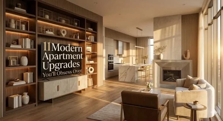
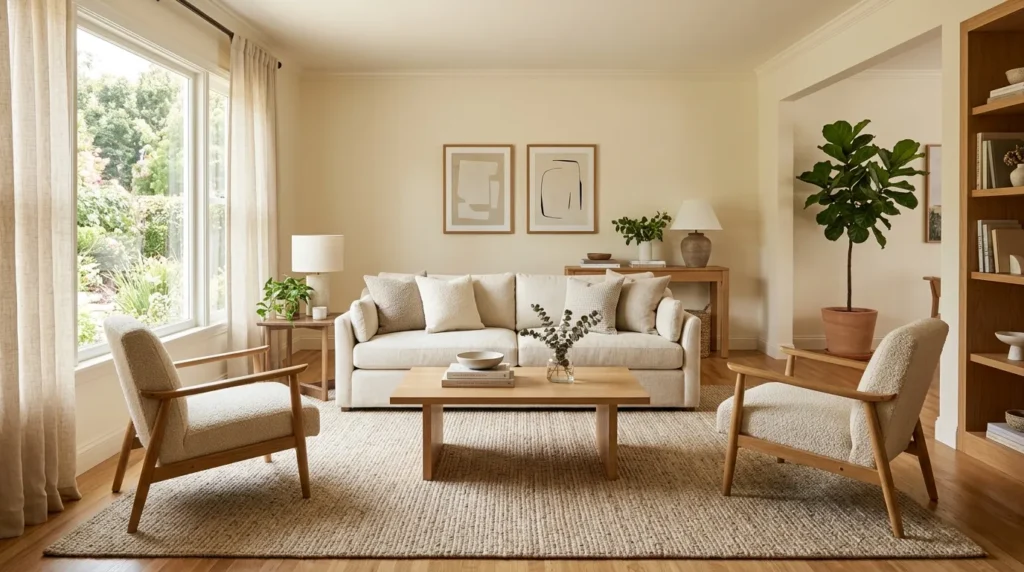
10 How to Style a Living Room Like a Pro
Introduction A beautifully styled room does not happen by accident. It comes from smart layout choices, balanced color, layered texture, good lighting, practical storage, and details that feel personal without looking cluttered. For USA homes, apartments, condos, rentals, and open-plan spaces, the goal is not to make the room look like a furniture showroom. The…

Introduction
A beautifully styled room does not happen by accident. It comes from smart layout choices, balanced color, layered texture, good lighting, practical storage, and details that feel personal without looking cluttered. For USA homes, apartments, condos, rentals, and open-plan spaces, the goal is not to make the room look like a furniture showroom. The goal is to create a space that feels warm, useful, polished, and comfortable for real life.
Many people search for how to style a living room because they already own decent furniture, but the space still feels unfinished. Usually, the problem is not the sofa or the coffee table. It is the missing connection between the pieces. A rug may be too small. The lighting may be too harsh. The wall art may be too high. The pillows may not repeat any color from the room. These small choices make a big difference.
The ideas below break down the styling process like a designer would approach it. Each section gives a practical visual upgrade, explains why it works, and shows how to use it in everyday spaces. You can use these ideas for a full refresh or choose one section at a time.
1. Layout First
- Pull furniture away from walls when space allows
- Create a clear conversation zone around the sofa
- Keep walkways open between doors, tables, and seating
- Use the rug to connect the furniture pieces
- Make every seat feel useful, not decorative only
A room starts looking professionally styled when the furniture has a clear purpose instead of simply lining the walls. The strongest layouts usually begin with the largest piece, often the sofa, then build a conversation area around it. Pull seating slightly inward when space allows, even if the room is small. In my experience, that one change can make the space feel more welcoming because people can actually talk, reach a table, and feel included. Good flow matters as much as beautiful furniture.
Leave clear paths between doorways, seating, and tables so the room feels easy to move through. A coffee table should sit close enough to use, but not so close that knees feel trapped. Accent chairs should relate to the sofa, not float randomly in a corner. Use a rug to anchor the arrangement and make the layout feel connected. Once the main pieces have the right spacing, the whole room feels calmer, more intentional, and much easier to decorate.
2. Color Palette
- Choose two or three main colors first
- Repeat accent shades through pillows, art, rugs, or decor
- Keep large furniture flexible if you change styles often
- Use warm neutrals to soften the room
- Add contrast through black, wood, brass, or deeper tones
A professional-looking space almost always has a controlled color palette, even when it includes bold accents. Start with two or three foundation colors, then add one or two accent shades for interest. This keeps the room from feeling random or overly busy. For many USA homes, warm neutrals, soft greens, muted blues, clay tones, black accents, and wood finishes work beautifully because they feel livable. I’ve noticed that rooms look more expensive when colors repeat in small ways.
Try pulling colors from a rug, artwork, pillow, or favorite textile instead of choosing everything separately. A rust tone in a print can repeat in a throw pillow. A deep green in a rug can return through a vase or plant. The goal is not perfect matching. It is visual connection. Keep large pieces more flexible if you like changing seasonal decor. When the palette is planned, even affordable furniture and accessories can look polished, layered, and thoughtfully chosen.
3. Texture Mix
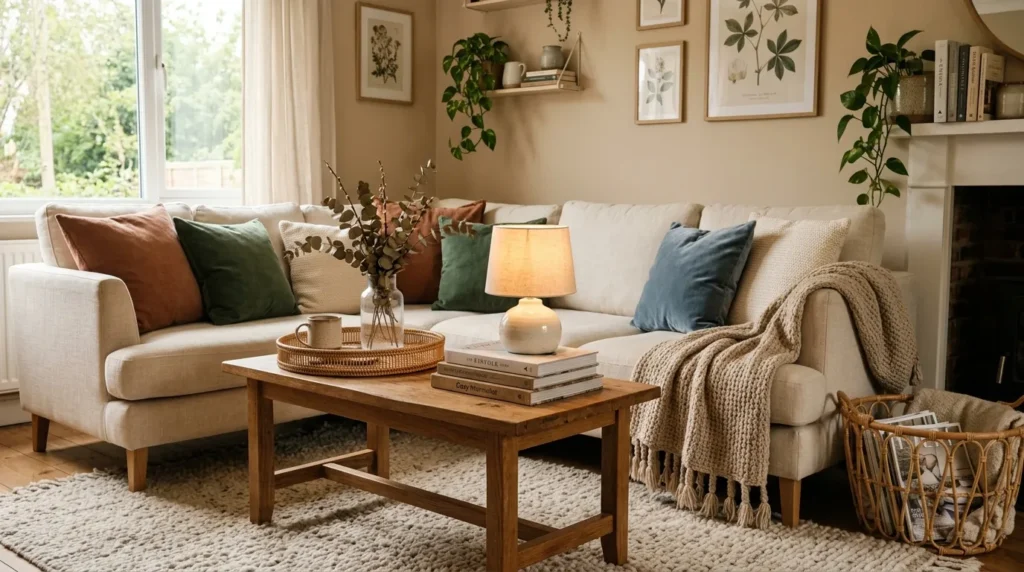
- Combine soft, woven, smooth, rough, and matte surfaces
- Use linen, wool, velvet, jute, rattan, wood, and ceramic
- Add texture when the room feels plain or flat
- Keep colors controlled so textures do not feel messy
- Balance shiny finishes with natural materials
Rooms feel flat when everything has the same surface, so texture is one of the easiest ways to create a designer look. Mix soft, smooth, rough, woven, matte, and polished materials so the space feels layered. A linen sofa, wool rug, wood table, ceramic lamp, velvet pillow, woven basket, and metal frame can all work together when the palette stays controlled. In my experience, texture is especially important in neutral rooms because it keeps beige, cream, and white from feeling empty.
Start with the pieces people touch most often. Pillows, throws, rugs, curtains, and upholstery should feel good, not just look nice. Then add harder textures through trays, tables, frames, and decorative objects. Natural materials like jute, rattan, oak, stone, clay, and linen add warmth without making the room feel cluttered. Avoid using too many shiny finishes in one area because they can compete. A textured room feels comfortable, camera-ready, and more collected than a space filled with flat matching pieces.
4. Layered Lights
- Use more than one light source
- Add table lamps, floor lamps, sconces, and accent lights
- Choose warm bulbs for a softer evening mood
- Place lighting near real activities
- Use dimmers or smart bulbs where possible
Lighting is where many rooms move from basic to beautifully styled. One overhead fixture usually creates harsh shadows and leaves corners feeling dull, so professionals layer light at different heights. Use table lamps, floor lamps, sconces, picture lights, candles, and accent lighting to create warmth. A living room should feel flexible enough for reading, hosting, watching TV, and relaxing at night. That’s why many designers recommend warm bulbs and dimmers wherever possible, especially in spaces used throughout the day.
Place lamps near actual activities instead of only where they look symmetrical. A floor lamp belongs beside a reading chair. A table lamp works near a sofa arm or console. Picture lights can highlight art, while shelf lighting adds depth to built-ins. Use warm white bulbs for a softer evening glow, and avoid mixing very cool and very warm bulbs in the same room. Better lighting makes colors richer, faces more flattering, and the whole space feel more expensive without changing furniture.
5. Rug Anchor

- Choose a rug large enough for the seating area
- Place front furniture legs on the rug when possible
- Use pattern to hide wear in busy homes
- Pick washable options for pets, kids, and high traffic
- Let rug colors guide pillows, art, and decor
The rug is the piece that visually holds the seating area together, so size matters more than most people think. A rug that is too small can make furniture look disconnected, even if every individual piece is beautiful. In many rooms, the front legs of the sofa and chairs should sit on the rug so the arrangement feels grounded. I’ve seen this work well in apartments, open-plan homes, and family rooms because the rug creates a clear zone without adding walls.
Choose a rug based on lifestyle before choosing pattern. Washable rugs help homes with kids, pets, or heavy traffic. Wool is durable and classic, while jute brings natural texture but may feel rough under bare feet. Vintage-inspired patterns hide wear beautifully and add character. Make sure the rug colors connect with the sofa, curtains, artwork, or pillows. A strong rug can set the whole mood, define the layout, soften sound, and make the room feel finished from the floor up.
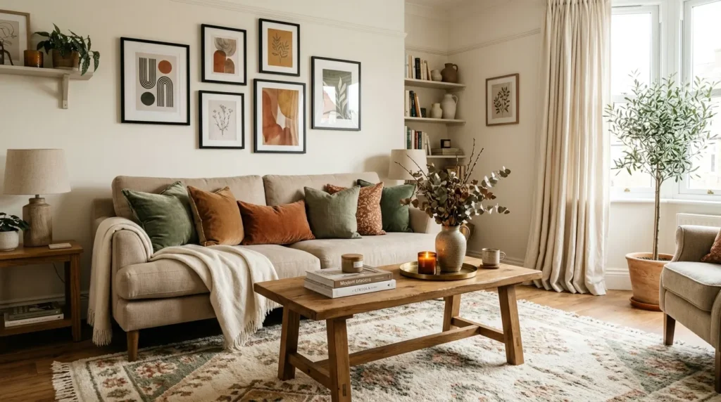
6. Wall Styling

- Hang art at a comfortable eye level
- Choose pieces large enough for the wall
- Relate wall decor to furniture below it
- Use matching frames for a cleaner look
- Test layouts with paper templates before hanging
Wall styling should feel connected to the furniture below it, not randomly placed on empty walls. The most common mistake is hanging art too high or choosing pieces too small for the area. Above a sofa, console, or fireplace, artwork should feel visually related to the furniture width. One oversized print, a pair of framed pieces, or a balanced gallery wall can make the room feel complete. In my experience, scale is what makes wall decor look professional.
Before hanging anything, test the arrangement with painter’s tape or paper templates. Keep the center of the artwork near eye level, but adjust slightly based on furniture height and ceiling scale. Choose frames that connect with other finishes in the room, such as black metal, brass, oak, walnut, or white. Mix personal photos with prints carefully so the wall feels meaningful, not chaotic. Well-placed art adds color, story, height, and structure while making the seating area feel intentionally designed.
7. Sofa Layers
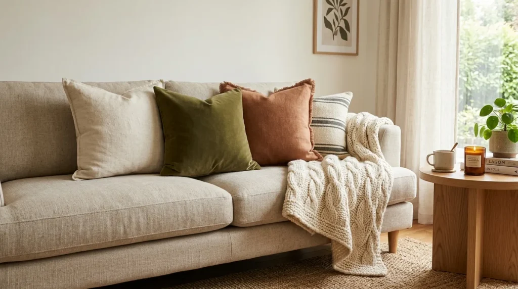
- Mix pillow sizes instead of using one shape
- Use a throw blanket for softness and color
- Repeat shades from the rug or artwork
- Keep enough open space for real sitting
- Choose washable covers for everyday homes
A room looks more professional when the sofa feels styled, but not overloaded. Pillows and throws should add comfort, color, texture, and shape without making people remove half the decor before sitting down. Start with pillow sizes that fit the sofa scale. Larger sofas can handle bigger pillows, while apartment sofas usually look better with fewer pieces. I’ve noticed that mixing two solids, one pattern, and one texture often creates a balanced look without feeling too staged.
Use inserts that fill the covers well so pillows do not look flat. Pair square pillows with a lumbar pillow for a cleaner arrangement, or use two matching pillows on each side for symmetry. Add a throw blanket folded over the arm, draped across the back, or placed in a basket nearby. Choose washable fabrics for busy homes. These soft layers make the room feel inviting, seasonal, and comfortable while adding the kind of finishing detail people notice immediately.
8. Table Styling

- Use a tray to group small decor
- Add height with books, vases, or candles
- Leave open space for drinks and remotes
- Repeat materials from the rest of the room
- Match styling to the table shape
Coffee tables look best when they are styled for real life, not just for photos. A professional arrangement usually includes height, texture, something practical, and a little negative space. Try a tray, stacked books, a small bowl, flowers or greenery, and one sculptural object. The tray keeps smaller items contained, while books create a base for decor. In my experience, the best coffee tables still leave room for drinks, snacks, remotes, and everyday use.
Match the styling to the table shape. Round tables look good with grouped objects near the center. Rectangular tables can handle a longer tray or two smaller zones. Ottomans need sturdy trays so the surface becomes useful. Use materials that repeat elsewhere in the room, such as wood, ceramic, glass, brass, or woven texture. Keep scented candles subtle if guests are sensitive. A well-styled table creates a focal point, supports daily routines, and helps the seating area feel complete.
9. Personal Details

- Display books, photos, art, and collected objects
- Edit shelves so they do not look crowded
- Use trays, baskets, and boxes to hide clutter
- Mix useful items with meaningful decor
- Rotate seasonal pieces instead of showing everything
Nothing makes a room feel more generic than decor with no connection to the people who live there. Personal pieces give the space warmth and memory. Books, framed photos, travel finds, handmade pottery, vintage boxes, heirlooms, artwork, and collected objects can make a room feel layered. The trick is editing. In my experience, a few meaningful objects displayed with care look stronger than many small pieces scattered across every surface. Personal style needs breathing room.
Create small display zones instead of spreading decor everywhere. A console can hold a lamp, framed photo, bowl, and vase. A bookshelf can mix books with ceramics, baskets, and art. A mantel can display a mirror, candlesticks, and one seasonal accent. Keep colors and materials connected so personal pieces still feel cohesive. Rotate items instead of showing everything at once. When meaningful decor is edited well, the room feels lived-in, polished, and far more memorable than a copied showroom look.
10. Focal Point

- Choose one main feature to lead the room
- Use furniture placement to support that feature
- Highlight fireplaces, art, windows, shelves, or statement sofas
- Reduce competing decor around the focal area
- Add lighting to draw attention where needed
The best styled rooms usually have a clear focal point that guides the eye. That focal point might be a fireplace, large artwork, beautiful window, media wall, built-in shelves, statement sofa, or sculptural light fixture. Without one, the room can feel scattered because every piece competes for attention. Decide what deserves the spotlight, then arrange furniture and decor to support it. This is one of the most useful steps when learning how to style a living room with confidence.
Once the focal point is clear, reduce anything that fights with it. If the fireplace is the star, keep the mantel balanced and avoid placing equally loud art nearby. If the sofa is bold, keep surrounding pieces calmer. If a window view is beautiful, frame it with curtains rather than blocking it. Use lighting to draw attention where needed. A focused room feels calmer, more expensive, and more intentional because every choice supports the same visual story.