10 School Hallway Background Ideas
A school corridor background does more than fill empty wall space. It sets the tone for first impressions, student photos, bulletin boards, seasonal displays, class projects, parent nights, and everyday movement between rooms. In many USA schools, corridors are used constantly, but the walls are often plain, scuffed, mismatched, or visually crowded. A thoughtful background…
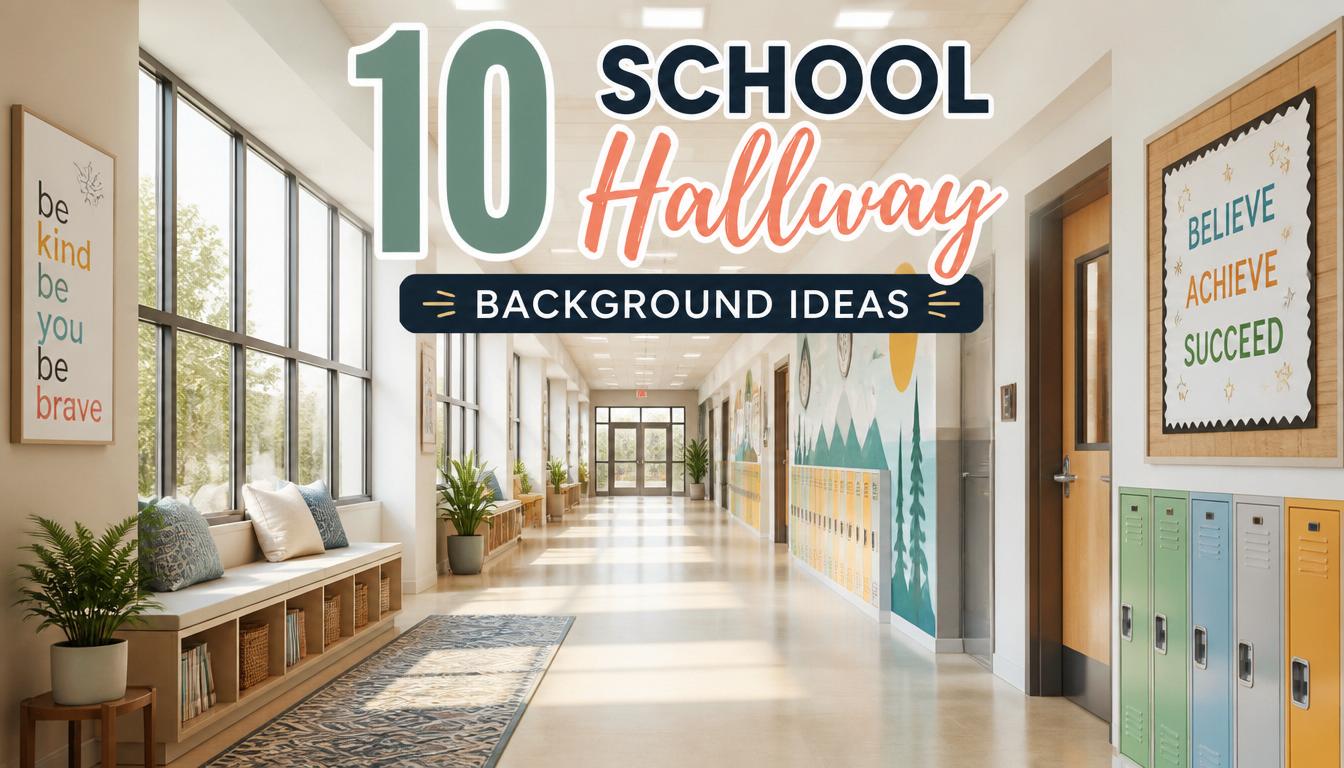
A school corridor background does more than fill empty wall space. It sets the tone for first impressions, student photos, bulletin boards, seasonal displays, class projects, parent nights, and everyday movement between rooms. In many USA schools, corridors are used constantly, but the walls are often plain, scuffed, mismatched, or visually crowded. A thoughtful background can make the entire space feel brighter, cleaner, more organized, and more welcoming without requiring a full renovation.
A strong School Hallway background should support the life of the building. It needs to look good in person, photograph well for newsletters or Pinterest-style inspiration, and hold up to busy student traffic. The best ideas are not always expensive. Painted panels, paper backdrops, murals, decals, fabric textures, student art grids, and color-zoned wall sections can all create a polished look when the layout is planned carefully.
The goal is to create a wall treatment that feels intentional, not random. A good background should make bulletin boards easier to style, school photos more attractive, and hallway displays more readable. It should also work with practical realities like fire codes, cleaning needs, wall durability, school colors, and seasonal changes. Below are 10 visually strong, realistic, and school-friendly background ideas that can help transform plain corridors into inspiring spaces students and families will notice.
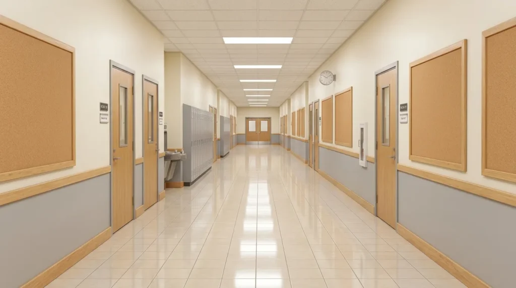
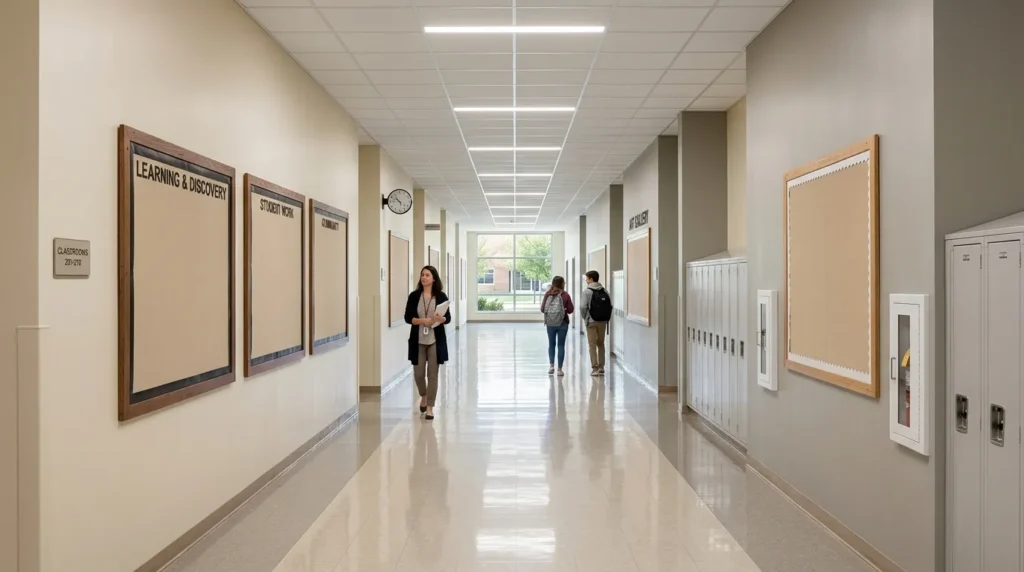
1. Neutral Wall Base
Bullet Points
- Creates a clean foundation for bulletin boards, photos, and student work.
- Makes colorful displays easier to read from a distance.
- Works well in elementary, middle, and high school corridors.
- Pairs beautifully with wood trim, black borders, school colors, or bright accents.
A neutral wall base can make a busy corridor feel calmer almost immediately. Schools often have colorful posters, student projects, signs, lockers, and doors competing for attention, so a simple background gives the eye a place to rest. Warm white, soft gray, greige, cream, oatmeal, or pale beige can make displays look sharper and more intentional. In my experience, neutral backgrounds work especially well when teachers update boards often, because almost every seasonal theme, grade-level color, or student project looks cleaner against a quiet wall.
The transformation comes from creating contrast without visual noise. A neutral base makes bright artwork, bold letters, and school announcements easier to see during quick passing periods. Use durable satin or eggshell paint that can handle cleaning, scuffs, and fingerprints. Add simple trim, a thin border, or matching bulletin board frames to keep the look polished. This idea is practical for older buildings because it freshens the hallway without requiring dramatic changes. The result feels brighter, more open, and easier to decorate throughout the school year.
2. Color Block Panels
Bullet Points
- Adds modern energy without covering the entire corridor in bright color.
- Helps organize different wings, grades, or subject areas.
- Creates a bold backdrop for student photos and display boards.
- Works with paint, vinyl shapes, removable panels, or bulletin paper.
Color block panels bring structure and personality to a corridor without making it feel chaotic. Instead of painting every wall a loud shade, choose specific sections for large blocks of color. These panels can frame classroom doors, highlight bulletin boards, or mark grade-level zones. Navy, gold, teal, forest green, red, or soft blue can reflect school branding while still feeling clean. That’s why many designers recommend using color in controlled sections, especially in educational spaces where the walls already carry a lot of information.
This idea works well because it gives each area a visual identity. A math wing might use blue panels, a reading area might use green, and a main entrance might feature school colors. Materials can include washable paint, peel-and-stick vinyl, large paper panels, or lightweight display boards. Keep the edges crisp with painter’s tape or trim so the design looks professional. Color blocking can also make photos, announcements, and student projects stand out more clearly. It turns plain walls into organized, purposeful design moments.
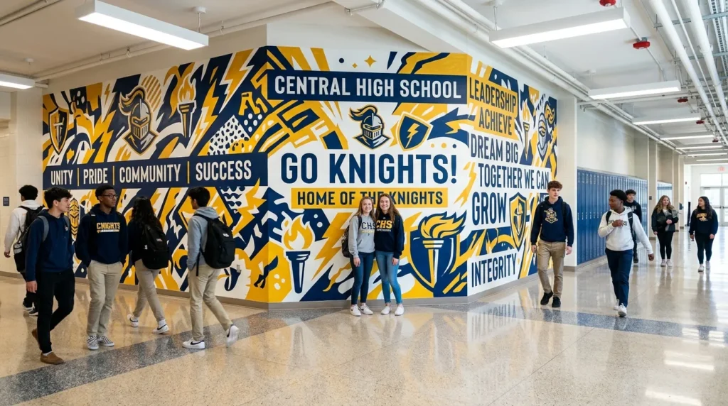
3. Mural Backdrop
Bullet Points
- Creates a memorable focal wall for photos, events, and school pride.
- Can include mascots, values, local landmarks, books, nature, or academic themes.
- Works as painted art, removable decals, or printed wall panels.
- Best when the design is bold, simple, and easy to recognize.
A mural backdrop can become the visual heart of a school corridor. It gives students, families, and staff a place that feels special, memorable, and connected to the school’s identity. The mural might feature a mascot, inspirational words, local community landmarks, a reading garden, a science galaxy, or a simple landscape in school colors. Keep the main shapes large and readable from across the hall. I’ve noticed that murals with fewer details usually photograph better and stay relevant longer than overly busy scenes.
The best mural backgrounds combine beauty with durability. Use washable paint, sealed artwork, removable wall decals, or printed vinyl panels depending on the building rules and budget. If students help create the mural, assign clear sections and limit the palette so the final result looks cohesive. A mural works beautifully near entrances, cafeterias, libraries, gyms, and main intersections. It can become a photo spot for open house, spirit week, graduation events, and classroom celebrations. The corridor gains identity, pride, and a polished focal point.
4. Bulletin Paper Wall
Bullet Points
- Offers a budget-friendly background that can change seasonally.
- Works for temporary themes, classroom displays, and event decorations.
- Easy for teachers and staff to install with borders and lettering.
- Best when paper is smooth, wrinkle-free, and color coordinated.
A bulletin paper wall is one of the most flexible background options for schools on a budget. It lets teachers and staff create a large visual impact without permanent changes, which is helpful for seasonal displays, testing motivation, reading challenges, and student showcases. Choose one strong background color, then add borders, title letters, and display pieces on top. The key is installation. Smooth paper carefully, secure edges neatly, and avoid layering too many patterns at once. A clean paper wall can look surprisingly polished when the colors are controlled.
This idea is especially practical for schools that refresh hallway displays often. Use fadeless bulletin board paper, butcher paper, roll paper, fabric-backed paper, or laminated reusable panels for better durability. Dark backgrounds make bright student work pop, while lighter colors create a softer look for younger grades. Add borders only where they help define the space. When maintained well, a paper wall becomes a simple, affordable, and easy-to-update backdrop for almost any school event. It gives the corridor fresh energy without a major decorating budget.
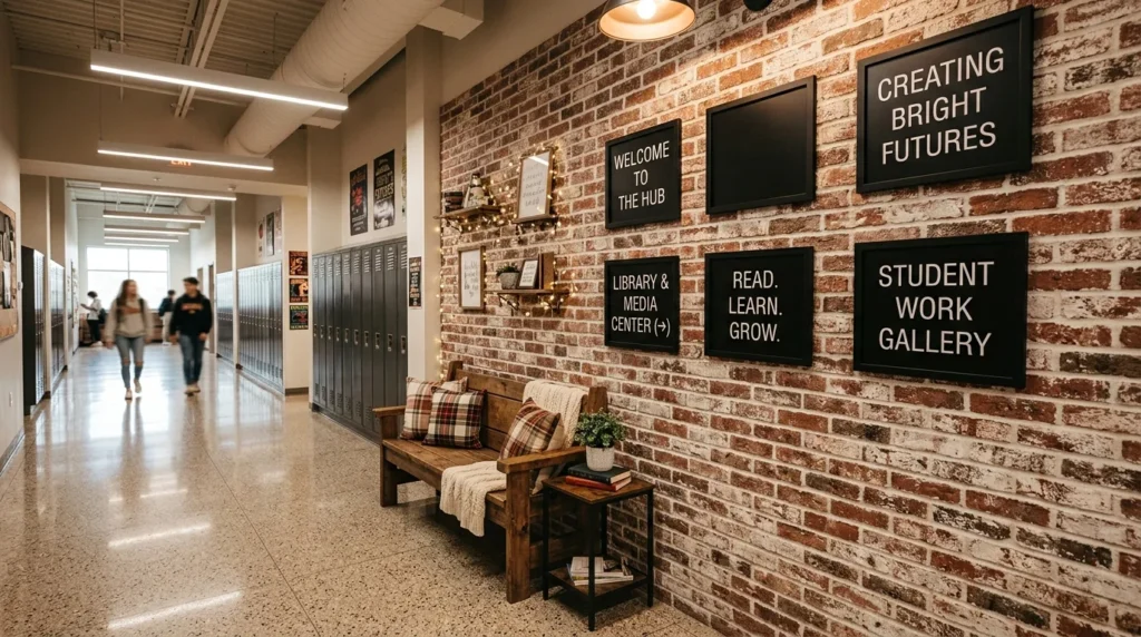
5. Brick Texture
Bullet Points
- Adds warmth, depth, and architectural character to plain walls.
- Works well for reading corners, history displays, and photo zones.
- Can be created with faux brick panels, peel-and-stick wallpaper, or printed paper.
- Looks best when paired with simple signage and warm lighting.
Brick texture gives a corridor a warmer, more architectural feeling without needing real masonry. Faux brick panels, peel-and-stick wallpaper, printed bulletin paper, or painted brick patterns can create depth on a flat wall. This background works beautifully for reading areas, history projects, school news displays, or cozy photo corners. Red brick feels classic and academic, while whitewashed brick feels softer and more modern. In my experience, brick-style backdrops look best when the surrounding decor stays simple, because the texture already adds plenty of visual interest.
The practical advantage is that brick texture hides small marks better than a plain painted wall. It also gives bulletin boards and displays a stronger sense of place, almost like a café wall, library corner, or old-school campus building. Pair it with black frames, wood shelves, warm lights, or simple letter boards for a polished effect. Avoid covering every hallway surface with brick, because too much texture can feel heavy. Used in one focused area, it creates a cozy, photo-friendly background students and families will remember.
6. Locker Color Wall
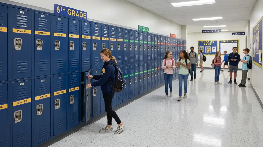
Bullet Points
- Turns locker rows into a coordinated visual background.
- Great for middle schools, high schools, and grade-level wings.
- Can use magnetic labels, removable decals, color strips, or school spirit accents.
- Helps older metal lockers feel more intentional and updated.
A locker color wall can make long rows of metal lockers feel like part of the design instead of visual clutter. Many middle and high school corridors are dominated by lockers, so coordinating them creates a stronger background for the entire space. Use magnetic strips, vinyl shapes, grade-level colors, locker number labels, or repeating mascot icons to create rhythm. The goal is not to cover every door completely. Smaller repeated details often look cleaner and are easier for staff to maintain.
This idea also supports organization and school identity. Color sections can mark grade levels, teams, houses, or classroom wings, making the corridor easier for students and visitors to understand. Use removable materials so lockers remain functional and damage-free. Keep locks, vents, handles, and nameplates clear. A coordinated locker background works well for school spirit weeks, sports seasons, club displays, and photo moments. It gives a practical storage area a more polished look while keeping the hallway usable during busy passing periods and daily student routines.
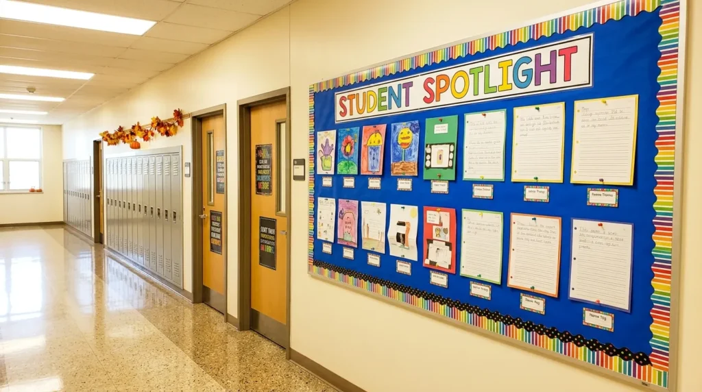
7. Student Art Grid
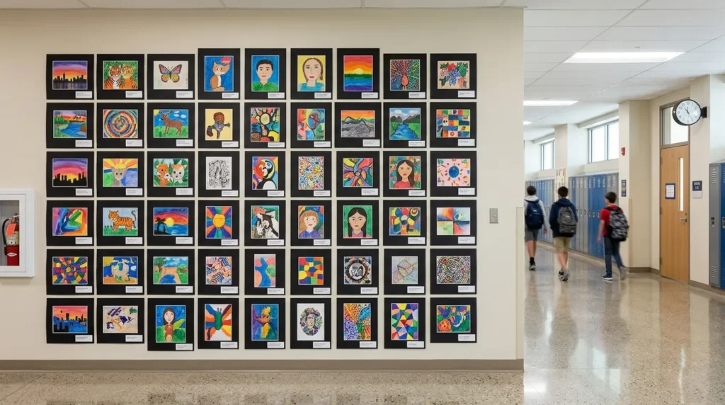
Bullet Points
- Turns student creativity into a polished background feature.
- Works for art classes, writing displays, STEM projects, or seasonal themes.
- Builds pride while making the corridor feel personal and active.
- Looks best with consistent sizing, spacing, labels, and backing colors.
A student art grid makes the corridor feel alive because it showcases real work in a structured way. Instead of placing projects randomly across the wall, arrange them in clean rows or columns with matching mats, labels, or backing paper. This turns student creativity into a background that feels intentional and gallery-like. Use equal spacing and consistent sizes whenever possible. I’ve seen this work well in many schools because students feel proud, families stop to look, and the hallway becomes a reflection of actual learning.
The grid format keeps the display from feeling messy, even when the artwork is colorful and varied. Use black paper mats for contrast, white labels for clarity, and laminated title cards to explain the project. Clipboards, binder clips, clothespins, or removable strips can make updates easier. This background is ideal near art rooms, elementary wings, media centers, or parent conference areas. It celebrates student voice while still giving the wall a clean design system. The result is personal, practical, and visually strong.
8. Nature Theme
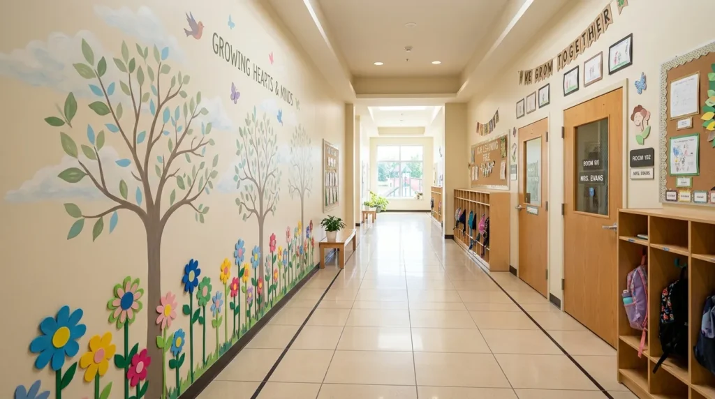
Bullet Points
- Creates a calming background with leaves, trees, flowers, or sky colors.
- Works well for elementary halls, counseling areas, and reading corners.
- Can support growth mindset, science, wellness, or seasonal displays.
- Looks best with soft colors, natural textures, and simple shapes.
A nature theme can soften a busy corridor and make it feel calmer for students. Tree silhouettes, leaf patterns, flower borders, clouds, garden scenes, or mountain shapes can create a gentle background that supports learning and wellness. This idea works especially well near counseling offices, libraries, reading corners, and elementary wings where a softer mood is helpful. Use muted greens, sky blues, warm browns, cream, and soft yellow instead of overly bright colors. Natural tones help the space feel peaceful rather than overstimulating.
This background can also connect beautifully to classroom themes. Add student goals as leaves on a tree, book recommendations as flowers, or science facts as garden labels. Materials might include painted murals, paper cutouts, vinyl decals, fabric leaves, or printed panels. Keep the shapes large enough to read from a distance and avoid tiny details that get lost in a long corridor. A nature-inspired wall brings freshness, movement, and warmth into the building. It makes the hallway feel less institutional and more welcoming.
9. Geometric Pattern
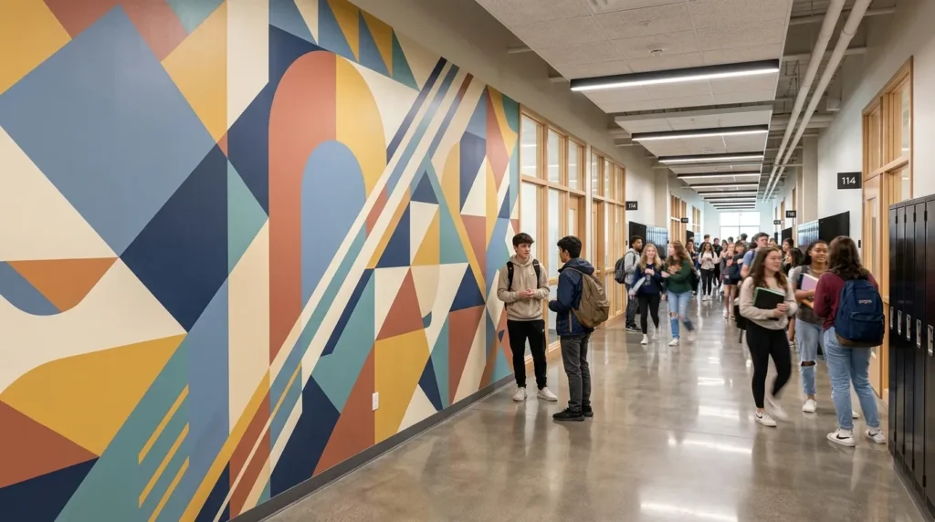
Bullet Points
- Adds a modern, energetic look without relying on themed characters.
- Works for older students, STEM wings, art halls, and contemporary campuses.
- Can be created with paint, tape, decals, or printed panels.
- Looks best with limited colors and repeated shapes.
A geometric pattern gives a corridor a clean, modern background that works across many grade levels. Triangles, arches, circles, diagonal stripes, grids, or abstract blocks can add movement without feeling childish. This is a smart option for middle schools, high schools, STEM areas, art wings, and newly updated buildings. Use painter’s tape for crisp painted shapes or removable decals for a less permanent version. Keep the palette limited to two or three colors so the pattern feels intentional instead of overwhelming.
The transformation is strongest when the pattern supports the architecture. A diagonal design can make a short wall feel more dynamic, while vertical shapes can make a low hallway feel taller. Use school colors, muted neutrals, or subject-related palettes for a connected look. Geometric backgrounds also photograph well because they create strong lines behind students, displays, or event setups. Avoid placing small text directly on a busy pattern. Leave clear zones for signs and announcements so the wall remains attractive and useful at the same time.
10. Photo Booth Corner
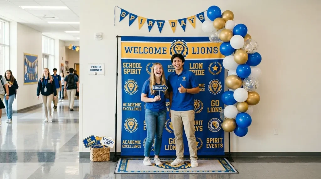
Bullet Points
- Creates a dedicated background for events, spirit days, and school photos.
- Works near entrances, libraries, gyms, offices, or cafeteria halls.
- Can include school colors, props, banners, balloons, or themed backdrops.
- Best when the design is reusable and easy to refresh.
A photo booth corner gives the building a fun, purposeful background for special moments. Schools often need attractive spots for open house, spirit week, award days, graduation events, book fairs, and classroom celebrations. Instead of decorating from scratch every time, create one reusable corner with a clean backdrop, school colors, and interchangeable accents. Use a wall section that has good lighting and enough space for a small group to stand safely. The design should look strong in vertical photos, since many families share school memories on phones.
This idea becomes more useful when the base stays consistent and the accents change. Start with a neutral, brick, mural, or color-block background, then add banners, balloon garlands, pennants, or seasonal signs when needed. Keep props in a labeled bin so staff can reuse them for different events. Avoid cluttering the floor, especially in high-traffic areas. A dedicated photo corner creates a polished spot for memories while protecting other hallway displays from constant rearranging. It adds fun, school pride, and practical event value.